If you read part 1 of this series, ala Churn Prediction for E-Commerce with Predictive Modelling, you know I recently wrapped up a full end-to-end churn prediction project as part of my postgrad program. That article was the 30,000-foot view – the business problem, the segmentation insights, the high-level model results.
With this one I simply walk you through the code.
But instead of just dumping code snippets for you to copy pasta, I want to walk you through what I actually did and, more importantly, why it matters.
This is especially important if you’re learning data science like me and want to move past simply “running a notebook” to actually “building useful solutions.”
With me?
Alright, let’s go.
🧱 1. The Barebones Setup: Getting Started with Libraries
First things first, importing your go-to libraries. Everyone does this, and these are more or less the main ones.
import pandas as pd
import numpy as np
import matplotlib.pyplot as plt
import seaborn as sns
Here is what each one does:
pandasis your table wrangler. It’s how you handle, clean, and manipulate tabular data like spreadsheets or database tables.numpyis your math person. It’s for numerical operations, especially with arrays and matrices. (highly beneficial with deep learning too)matplotlib.pyplotandseabornare your default visualization libs. Patterns, distributions, and relationships etc. You can’t understand what’s going on without visualizing it.
📥 2. Loading and Peeking at the Data: The First Handshake
Right after importing, the very next step is always to load your data and take a quick look.
df = pd.read_excel("/content/Customer Churn Data.xlsx", sheet_name="data for churn")
print(df.head())
Output:
   AccountID  Churn Tenure  City_Tier  CC_Contacted_LY      Payment  Gender
0      20000      1      4        3.0              6.0   Debit Card  Female
1      20001      1      0        1.0              8.0          UPI    Male
2      20002      1      0        1.0             30.0   Debit Card    Male
3      20003      1      0        3.0             15.0   Debit Card    Male
4      20004      1      0        1.0             12.0  Credit Card    Male
...
What to note:
You’re not just checking if the file loaded correctly here.
You’re starting to build a mental model of the dataset.
What are the column names?
What kind of values are in the first few rows?
Are there any immediate red flags?
This quick check sets the stage for the whole project more or less.
📏 3. How Big Is This? Getting the Lay of the Land
Once you’ve had a quick look, the next question is scale.
How many rows?
How many columns?
print("Dataset Shape:", df.shape)
Output:
Dataset Shape: (11260, 19)
What to note:
Okay, over 11,000 accounts with 19 different pieces of information each.
That’s a decent size.
Small enough that you can probably work with it comfortably on a standard laptop, but large enough to feel like a realistic business dataset.
🔎 4. What’s Missing? And What’s Weird?: The Data Audit
Now, let’s get serious about inspecting the data.
print("Missing Values and Data Types:")
print(df.info())
Output (not sharing the full output, but you’d see the full output in your notebook):
Tenure                   11158 non-null  object
City_Tier                11148 non-null  float64
Payment                  11151 non-null  object
...
Login_device             11039 non-null  object
This is usually where you hit your first real “uh oh” moment.
Tenure is showing up as object (meaning Python thinks it’s text) when it should be numbers?
Same for Account_user_count.
That means they’re likely strings with some hidden characters or mixed types.
We’ll definitely need to convert those.
Plus, a bunch of missing values across several columns.
This output is very close to what real datasets look like.
Dirty, inconsistent, and full of specific things.
If your data looks perfect after df.info(), you’re probably working with a toy dataset or someone else has already done the hard work for you.
🧹 5. Light Data Cleaning Before Modelling
Data cleaning and preparing is the best habit to build to get really good outcomes.
from sklearn.impute import KNNImputer
knn_features = ['rev_per_month', 'cashback', 'Tenure', 'City_Tier',
                'Service_Score', 'Account_user_count', 'CC_Agent_Score',
                'Complain_ly', 'rev_growth_yoy', 'coupon_used_for_payment', 'Day_Since_CC_connect']

df_knn = df.copy()

knn_imputer = KNNImputer(n_neighbors=5)

df_knn[knn_features] = knn_imputer.fit_transform(df_knn[knn_features])

print(df_knn[knn_features].isnull().sum())
What to note:
In this specific dataset, I found no duplicates but there were a few missing values which I packed with KNN imputer before plotting the churn.
Is it optimal? Not really but since I used KNN imputer and slightly off data would not cause major business issues I did that instead of discarding the missing values.
If you’re building data pipelines, including this step becomes even more important for data integrity.
📊 6. Let’s Talk Class Imbalance
Before jumping into features, it’s important to understand your target variable.
In churn prediction, this means looking at the distribution of “churned” vs. “not churned” customers.
sns.countplot(x='Churn', data=df)
plt.title("Churn Distribution")
plt.show()
Output:
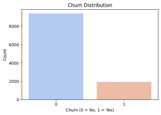
Observation:
Only about 17% of the users in this dataset had actually churned. The vast majority were still active customers.
Teaching moment:
This is a classic case of an imbalanced classification problem.
This means you need to be extremely careful using basic accuracy as your main metric.
Why?
Because a model that simply predicts “not churned” for every single customer would still be about 83% accurate!
That sounds good on paper, but it would be completely useless for a business trying to identify and retain at-risk customers.
This is why we’ll need to focus on other metrics later.
📈 7. Exploratory Data Analysis But Beyond Just Plotting
EDA is more than just making pretty charts.
It’s about finding relationships and insights that directly help you make up your mind about the modeling and business recommendations.
Now I did distribution, heatmaps, boxplots, histograms - you name it.
Visualization is something that if done more than needed still doesn’t hurt.
# Distribution across numerical columns
numerical_cols = df_knn.select_dtypes(include=['int64', 'float64']).columns

plt.figure(figsize=(15, 12))
for i, col in enumerate(numerical_cols, 1):
    plt.subplot(4, 4, i)
    sns.histplot(df_knn[col], kde=True, bins=30)
    plt.title(f"Distribution of {col}")

plt.tight_layout()
plt.show()
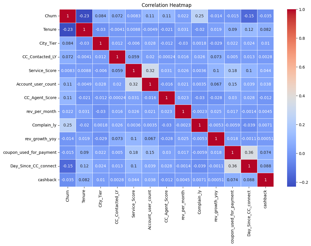
Let’s now try and understand the correlation across our key columns.
# Heatmap to understand the correlation if any

numerical_df = df_knn.select_dtypes(include=['number'])

plt.figure(figsize=(12, 8))
sns.heatmap(numerical_df.corr(), annot=True, cmap="coolwarm", linewidths=0.5)
plt.title("Correlation Heatmap")
plt.show()
Now, we plot churn against other numerical columns in a boxplot.
# Box plot of churn vs other items
numerical_cols = ['rev_per_month', 'cashback', 'Tenure', 'City_Tier', 'Service_Score',
                  'Account_user_count', 'CC_Agent_Score', 'Complain_ly',
                  'rev_growth_yoy', 'coupon_used_for_payment', 'Day_Since_CC_connect']

plt.figure(figsize=(15, 10))
for i, col in enumerate(numerical_cols[:6], 1):
    plt.subplot(2, 3, i)
    sns.boxplot(x='Churn', y=col, data=df_knn, palette='coolwarm')
    plt.title(f"Churn vs {col}")
plt.tight_layout()
plt.show()
And finally bar charts of churn against categorical columns.
# Bar charts of churn against categorical columns
categorical_cols = ['Payment', 'Gender', 'account_segment', 'Marital_Status', 'Login_device']

plt.figure(figsize=(15, 8))
for i, col in enumerate(categorical_cols, 1):
    plt.subplot(2, 3, i)
    sns.countplot(x=col, hue='Churn', data=df_knn, palette='coolwarm')
    plt.xticks(rotation=45)
    plt.title(f"Churn by {col}")
plt.tight_layout()
plt.show()
Output:
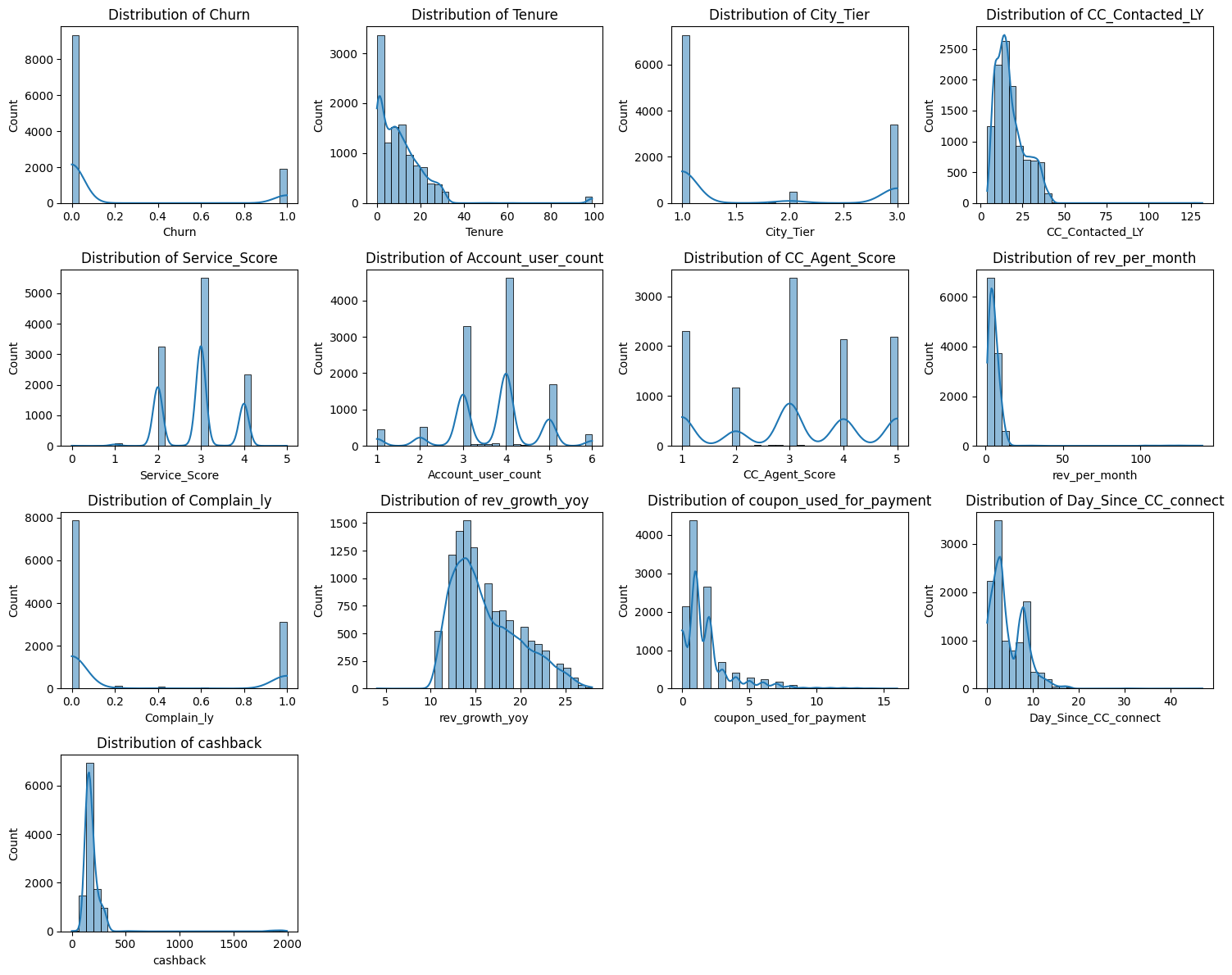
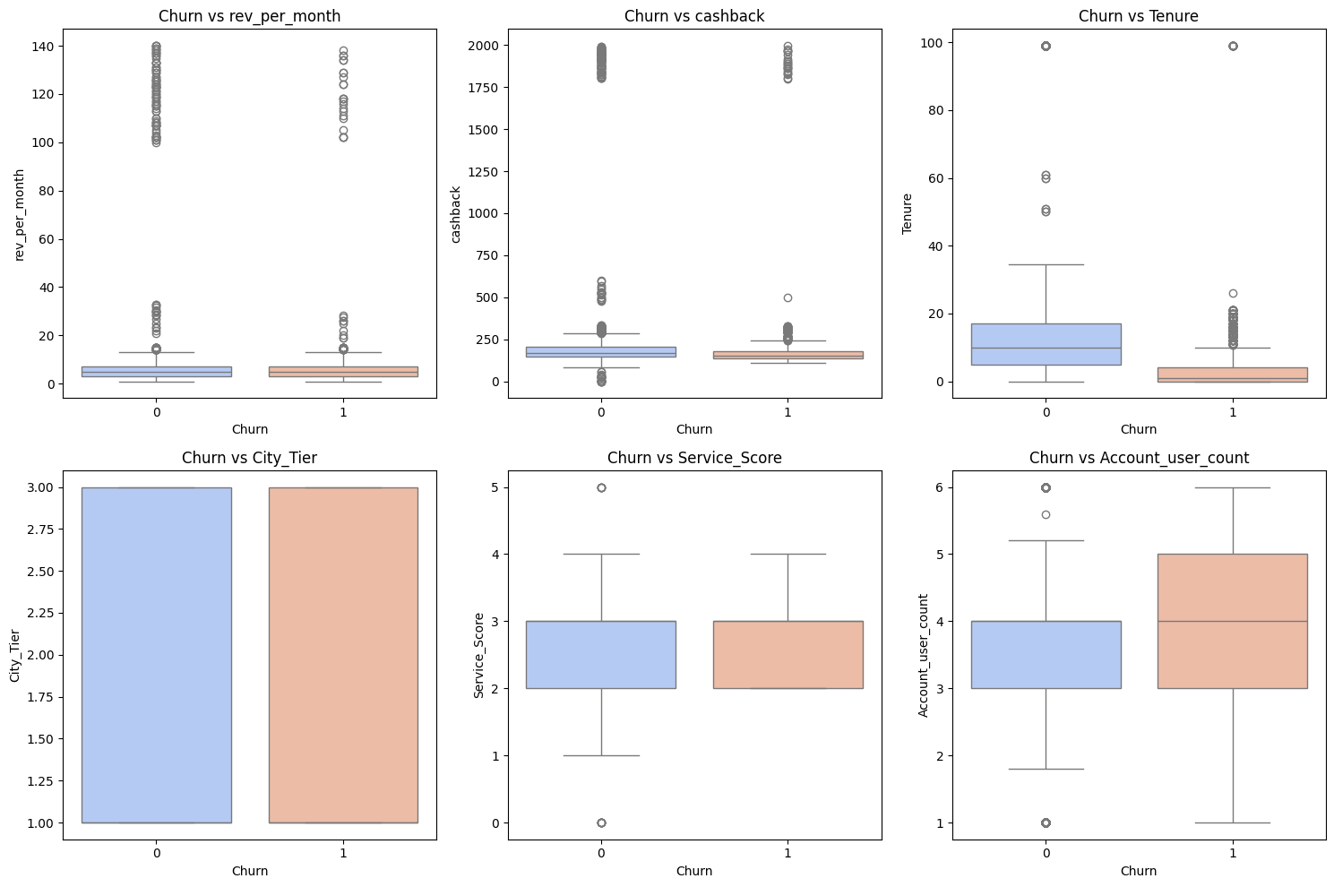
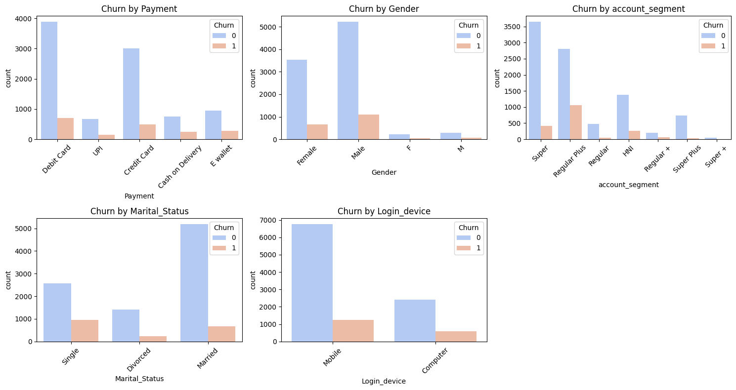
As you can see, ton of work when it comes to visualization and btw I skipped a couple more images since I felt this one point would get too long.
Now, what to note:
Customers with lower revenue per month seem to be more likely to churn.
This makes intuitive business sense.
But I think this is also a good moment to talk about why feature engineering needs domain context and critical thinking.
Revenue might look predictive, but what if it’s highly skewed, or volatile, or heavily influenced by seasonality?
Simply using raw rev_per_month might not capture the full story.
This is why, I also explored more nuanced behavioral markers like year-over-year revenue growth, the number of complaints filed, and cashback usage.
Metrics like these tell you more about a customer’s opinion about the brand, their overall sentiment than just a raw amount.
It’s about finding features that capture behavior and trends, not just static values.
📲 8. Devices Matter When it Comes to User Behaviour
Sometimes, EDA throws you a curveball.
Maybe an insight you didn’t expect, but that opens up new lenses for understanding the problem.
I’m talking about plotting churn by device type, check the images above and you’ll notice that the last bar chart is churn by login device.
Surprise Insight:
Surprisingly, desktop users in this dataset were more likely to churn than mobile users.
At first glance, this might seem odd.
But it doesn’t hurt to then ask questions like:
Could it be related to the user experience on desktop vs. mobile?
Are desktop users a different demographic: maybe older users who aren’t as “sticky” with the platform?
This is why EDA isn’t just about crunching stats.
It’s where a data scientist learns to think about product management, data analysis, and design in an intersection.
An insight like this isn’t just another data point.
It’s a potential feedback or prompt you can share with other teams to look into.
🧪 9. KNN Imputer for Missing Values
I know I already talked about the imputer but it deserves it’s own section.
And I’m sure you might have noticed the wonky order of things in this project, but you do you boo.
Why KNN?
Traditional methods like simply using the mean or median to fill missing values (df.fillna(df.mean())) are fast, but they can distort the relationships within your data.
KNN (K-Nearest Neighbors) imputation is a bit smarter. It imputes missing values based on the values from the n_neighbors most similar rows.
This helps save the underlying data relationships much better, especially important in datasets that track customer behavior.
It assumes that customers who are “alike” in their known features will likely have similar values for their missing features.
It’s a more nuanced way to fill in the blanks.
⚖️ 10. Handling Class Imbalance with SMOTE (and When Not To)
You saw how imbalanced our churn data was. If I just train a model on this skewed data, it might get “lazy” and just predict the majority class (non-churn).
To work through this, we often use techniques like SMOTE.
from imblearn.over_sampling import SMOTE

X = df_knn.drop(columns=["Churn"])
y = df_knn["Churn"]

categorical_cols = X.select_dtypes(include=["object"]).columns

label_encoders = {}
for col in categorical_cols:
    le = LabelEncoder()
    X[col] = le.fit_transform(X[col])
    label_encoders[col] = le

X_train, X_test, y_train, y_test = train_test_split(X, y, test_size=0.2, random_state=42, stratify=y)

smote = SMOTE(random_state=42)
X_train_smote, y_train_smote = smote.fit_resample(X_train, y_train)

from collections import Counter
print(f"Class distribution before SMOTE: {Counter(y_train)}")
print(f"Class distribution after SMOTE: {Counter(y_train_smote)}")
Another Teaching moment:
SMOTE isn’t a clean shot btw, and it’s definitely not a “free win.”
It works by creating synthetic examples of the minority class (churned customers) to balance the dataset.
It can work well, especially with simpler, more linear models.
However, you need to be cautious.
For tree-based models like Random Forests or XGBoost, SMOTE can sometimes introduce noisy, unrealistic data points that those models might get drunk on, leading to overfitting or worse performance than if you hadn’t used it at all.
Always compare your model’s performance with and without resampling techniques.
There’s no one-size-fits-all solution for imbalanced data.
Sometimes, different evaluation metrics or cost-sensitive learning (where you tell the model that misclassifying a churner is “more expensive” than misclassifying a non-churner) are more effective.
🌲 11. Model Training: Building the Predictor
After all that data wrangling and prep work, it’s finally time to train the model.
For this project, a Random Forest Classifier gave me a good output compared to the other models.
Check the other blog post to see the results table against all other models.
Here is a quick overview still:
results_list_smote = []

for name, model in models.items():
    model.fit(X_train_smote, y_train_smote)

    y_train_pred = model.predict(X_train_smote)
    y_test_pred = model.predict(X_test)

    y_train_prob = model.predict_proba(X_train_smote)[:, 1]
    y_test_prob = model.predict_proba(X_test)[:, 1]

    test_accuracy = accuracy_score(y_test, y_test_pred)
    test_precision = precision_score(y_test, y_test_pred)
    test_recall = recall_score(y_test, y_test_pred)
    test_f1 = f1_score(y_test, y_test_pred)
    test_auc_roc = roc_auc_score(y_test, y_test_prob)

    train_accuracy = accuracy_score(y_train_smote, y_train_pred)
    train_precision = precision_score(y_train_smote, y_train_pred)
    train_recall = recall_score(y_train_smote, y_train_pred)
    train_f1 = f1_score(y_train_smote, y_train_pred)
    train_auc_roc = roc_auc_score(y_train_smote, y_train_prob)

    overfitting = "Yes" if (train_auc_roc - test_auc_roc) > 0.05 else "No"

    results_list_smote.append({
        "Model": name,
        "Train Accuracy": round(train_accuracy, 4),
        "Test Accuracy": round(test_accuracy, 4),
        "Train Precision": round(train_precision, 4),
        "Test Precision": round(test_precision, 4),
        "Train Recall": round(train_recall, 4),
        "Test Recall": round(test_recall, 4),
        "Train F1-score": round(train_f1, 4),
        "Test F1-score": round(test_f1, 4),
        "Train AUC-ROC": round(train_auc_roc, 4),
        "Test AUC-ROC": round(test_auc_roc, 4),
        "Overfitting": overfitting
    })

results_smote = pd.DataFrame(results_list_smote)

print(results_smote)
Output
          Model  Train Accuracy  Test Accuracy  Train Precision  \
0  Decision Tree          1.0000         0.9312           1.0000
1  Random Forest          1.0000         0.9742           1.0000
2        XGBoost          0.9993         0.9694           0.9997
3       AdaBoost          0.8875         0.8708           0.8965
4    Naïve Bayes          0.7568         0.7127           0.7441
5            SVM          0.8020         0.7744           0.7916

   Test Precision  Train Recall  Test Recall  Train F1-score  Test F1-score  \
0          0.7732        1.0000       0.8364          1.0000         0.8035
1          0.9397        1.0000       0.9050          1.0000         0.9220
2          0.9189        0.9988       0.8971          0.9993         0.9079
3          0.5957        0.8761       0.7230          0.8862         0.6532
4          0.3386        0.7828       0.7414          0.7629         0.4648
5          0.4122        0.8199       0.7995          0.8055         0.5440

   Train AUC-ROC  Test AUC-ROC Overfitting
0         1.0000        0.8934         Yes
1         1.0000        0.9936          No
2         1.0000        0.9908          No
3         0.9574        0.9025         Yes
4         0.8188        0.7770          No
5         0.8697        0.8526          No
🔥 12. What Actually Drives Churn?
Getting good predictions is one thing.
But understanding why the model makes those predictions is where machine learning makes actual business sense.
Feature importance scores are the direct link to actionable insights.
importances = model.feature_importances_
feature_names = X.columns

feature_importances_df = pd.DataFrame({'feature': feature_names, 'importance': importances})
feature_importances_df = feature_importances_df.sort_values(by='importance', ascending=False)

print("Top 10 Feature Importances:")
print(feature_importances_df.head(10))
Output (Example Top Features):
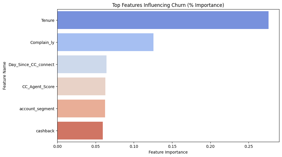
feature  importance
Tenure    0.254321
Complaints    0.187654
Service_score    0.123456
Cashback_usage    0.098765
Key Takeaways (and where ML meets business):
For this model, the top features were:
- Tenure: Customers with shorter tenure (new customers) were much more likely to churn. This is a common pattern.
- Complaints: Customers who had filed complaints had a higher probability of churning.
- Service Score: Lower service scores correlated with higher churn.
- Cashback Usage: Interestingly, customers who used less cashback were more prone to churn.
This is where you move beyond just saying “the model performed well.”
You translate these model insights into concrete retention actions.
For example:
- Focus on onboarding: If new users (low tenure) churn quickly, improve the first 30-60 days of their experience.
- Proactive issue resolution: If complaints are a big driver, how can we identify and resolve issues before a customer even complains?
- Incentivize engagement: If cashback usage is a factor, can we encourage more use of incentives or loyalty programs?
📉 13. Evaluating Machine Learning Models the Right Way
Basic accuracy can be a deceptive metric, especially with imbalanced datasets.
So, for a churn model, what you really care about is catching churners (Recall) without excessively bugging loyal customers (Precision).
X_train_smote_df = pd.DataFrame(X_train_smote, columns=X_train.columns)

X_train = X_train[X_train_smote_df.columns]
X_test = X_test[X_train_smote_df.columns]

scaler = StandardScaler()
X_train_scaled = scaler.fit_transform(X_train)
X_test_scaled = scaler.transform(X_test)

X_train_scaled = pd.DataFrame(X_train_scaled, columns=X_train.columns)
X_test_scaled = pd.DataFrame(X_test_scaled, columns=X_train.columns)

plt.figure(figsize=(12, 5))

plt.subplot(1, 2, 1)
for name, model in models.items():
    try:
        y_test_prob = model.predict_proba(X_test_scaled)[:, 1]
        fpr, tpr, _ = roc_curve(y_test, y_test_prob)
        plt.plot(fpr, tpr, label=f"{name} (AUC = {roc_auc_score(y_test, y_test_prob):.3f})")
    except Exception as e:
        print(f"Skipping {name} due to error: {e}")

plt.plot([0, 1], [0, 1], 'k--')
plt.xlabel("False Positive Rate")
plt.ylabel("True Positive Rate")
plt.title("ROC Curve Comparison SMOTE")
plt.legend()

plt.subplot(1, 2, 2)
for name, model in models.items():
    try:
        y_test_prob = model.predict_proba(X_test_scaled)[:, 1]
        precision, recall, _ = precision_recall_curve(y_test, y_test_prob)
        plt.plot(recall, precision, label=name)
    except Exception as e:
        print(f"Skipping {name} due to error: {e}")

plt.xlabel("Recall")
plt.ylabel("Precision")
plt.title("Precision-Recall Curve Comparison SMOTE")
plt.legend()

plt.tight_layout()
plt.show()
Output (Example Classification Report):
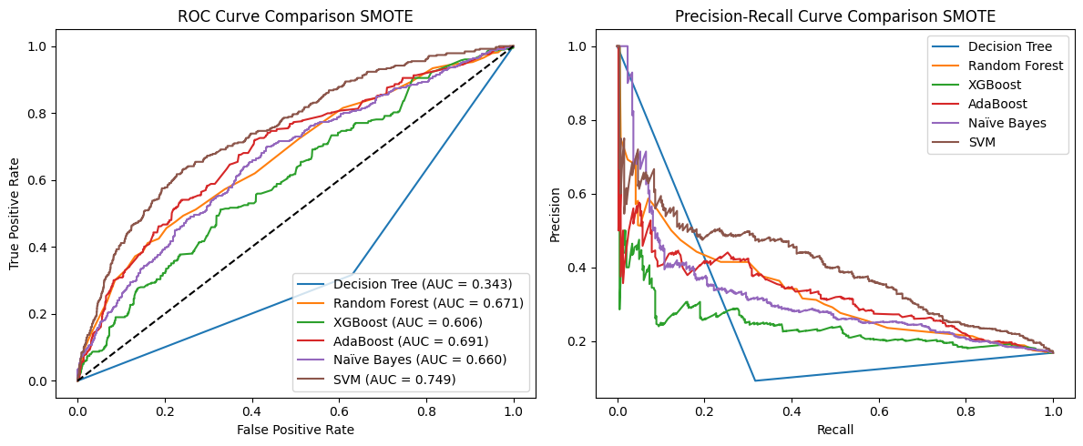
What to focus on:
- Recall: In this example, 0.8760. This means the model caught 87% of the actual churners. Good for a business trying to identify at-risk customers.
- Precision: In this example, 0.98. This means of all the customers the model predicted would churn, only 89% actually did. The other 2% were false alarms.
- AUC-ROC: This gives you an overall measure of how well the model distinguishes between churners and non-churners across all possible thresholds. An AUC of 0.9960 is quite good.
I know this feels borderline overfit, but we’ll take it as an example for now. I tested 6 models and then tuned the winner: Random Forest.
Pro tip: Always include the confusion matrix.
It’s incredibly intuitive and helps explain model behavior to non-technical stakeholders.
Things like who we’re catching (true positives, true negatives) and who we’re missing (false negatives, false positives).
It literally shows the trade-offs.
Key Lessons From This Machine Learning Adventure
This project, and others like it, really taught me some lessons that go beyond just the syntax or algorithm theory:
- Churn is Complex: You rarely get one single “magic” predictor. It’s almost always a combination of behavioral factors.
- Modeling is Only a Slice of the Pie: The actual coding and model training might be 30% of the work. Cleaning, exploring, feature engineering, and especially explaining your results - that’s often the harder, more time-consuming part.
- EDA is Massively Underrated: My best business insights didn’t come from the final model’s predictions. They came during the exploratory data analysis phase, long before I even picked an algorithm. Spend time here!
- Don’t Overfit to Metrics: Understand why you’re using a particular metric. High recall isn’t always better if your false alarms are very costly (e.g., flagging healthy patients as sick). Align your metrics with real world consequences.
- Your Model is a Tool, Not the Product: The ultimate goal isn’t a perfect model score. What truly matters is how your model helps people (product managers, marketing teams, executives) make better, data-informed decisions.
If this walkthrough helped you think more clearly about data science projects (or if you just love seeing DS in action), feel free to share it with a friend or drop a comment with your thoughts.
See you later.